
Bento
A Calm, Flexible Meal Planner that makes weekly meal prep and eating healthy feel easy, not overwhelming.
What if meal planning felt simple again? Tired of cluttered apps, calorie tracking, and decision overload, I set out to design a solution that supports everyday home cooks who just want to eat well without the stress.
Bento is a flexible meal prep tool that helps people plan, customize, and prep healthy meals with less effort. It’s built to make weekly cooking more manageable, efficient, and doable.
Tools:
Figma, Adobe Photoshop & Illustrator


Why Bento
Problem
Meal planning often feels like an exhausting task — between decision overload, strict diet apps, and complicated prep flows, many people give up before they even start. Existing tools aren’t built for everyday users who just want to eat well without spending hours in the kitchen or overthinking every calorie.
Goal
Design a practical, flexible meal prep tool that makes it easy to plan, customize, and cook healthy meals in less time. Bento aims to simplify the experience for real people with busy lives — helping them stay consistent, save time, and reduce the stress of weekly cooking.

The Research Behind Bento


Key Patterns & Insights
🧠 Decision Fatigue
Users are mentally exhausted after work and don’t want to make new decisions around food
⏱️ Time Pressure
Users want healthy meals, but time limits make long prep unsustainable
🧭 Need for Simplicity
Users are turned off by apps that feel like work — too many steps, rules, or tracking
🎨 Visual Planning is Appealing
Users responded positively to simple visuals
Design Principles
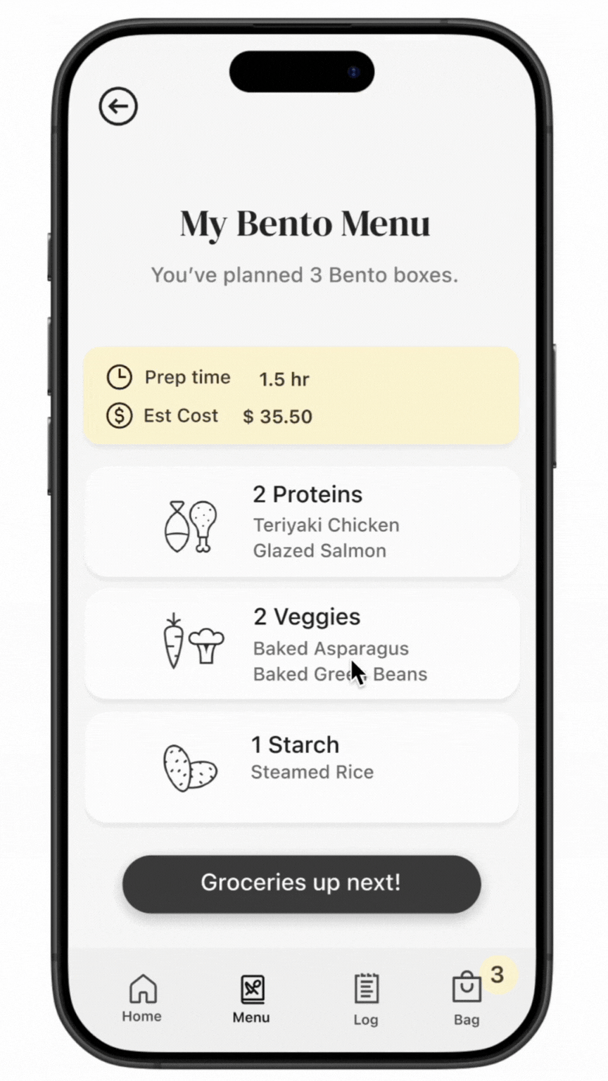
✅ Reduce mental load — Offer 6–10 curated meal options with visuals, simple macros, and pricing to eliminate overwhelming choices.
✅ Design for ease, not perfection — Recipes are balanced, forgiving, and don’t require “tracking” or strict rules — just enough to feel in control.
✅ Make it flexible and intuitive — Let users select quantities and customize carbs, proteins, and fats with ease. No friction, no fuss.
✅ Be visually intuitive — Use meal imagery and minimalist layouts to guide decision-making faster than traditional forms or tracking screens.
Ideation & Prototyping


User Testing
What Worked Well
Clear visual hierarchy: All testers easily understood the flow from meal selection to prep. The visuals and simple language helped guide them without confusion.
Customizing sides felt intuitive: Participants liked how easy it was to skip or choose sides without navigating away.
Step-by-step cooking guide felt calming: Users appreciated that it told them exactly what to do, and in what order, without being overwhelming.
"This feels like I’m being walked through it, not managing it all myself."
— Test Participant
Feedback
“I wasn’t sure if I selected enough meals for the week.”
“I wish the cooking steps were grouped more visually.”
“I didn’t notice the ‘Edit Sides’ link right away.”
Changes I Made
✅ Added a gentle reminder or count at the bottom to show total meals selected
✅ Adjusted layout to visually separate steps into categories (e.g. starches, proteins)
✅ Made the ‘Edit Sides’ text more prominent and styled like a button for better visibility
Outcome

Working on Bento reminded me how powerful simple design can be. I learned that people don’t just want tools, they a experiences that feel calm and supportive.
Next, I’d love to explore smarter recommendations and even voice-guided cooking to make meal prep even easier.
